.avif)


A critical designer's perspective on WWDC25's biggest announcement
Apple just unveiled what they're calling the most comprehensive visual redesign since iOS 7. The "Liquid Glass" design language is now flowing across every Apple device - from iPhone to Vision Pro. But while everyone's mesmerized by the shimmer and flow, I'm seeing some fascinating contradictions that deserve a deeper look.
The Liquid Glass Aesthetic: What Actually Changed
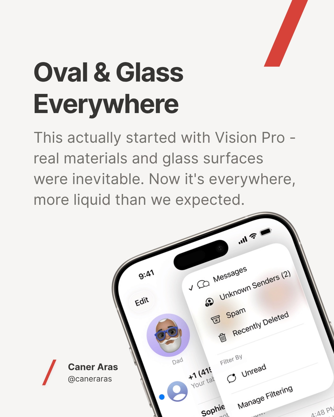
Picture your iPhone interface turning into liquid mercury. That's essentially what Apple achieved with Liquid Glass. Buttons morph into oval capsules, backgrounds ripple and reflect surroundings, and lock screens feature time that literally melts behind your photos.
The visual transformation is undeniably striking:
- Dynamic translucent materials that refract and reflect like real glass
- Real-time rendering with specular highlights responding to device movement
- Contextual adaptation where interface elements morph based on content
- Unified design language spanning iOS 26, iPadOS 26, macOS Tahoe, watchOS 26, tvOS 26, and visionOS 26
This isn't just a cosmetic update. Apple has fundamentally reimagined how we interact with digital surfaces, making them feel more tactile and physically present.

The Vision Pro Connection: Where It All Started
This liquid transformation didn't happen in a vacuum. The Vision Pro's emphasis on real materials and glass surfaces telegraphed this direction. What we're seeing now is that spatial design philosophy applied to traditional 2D interfaces.
The circular, oval forms we're seeing everywhere represent Apple moving away from their traditional rectangular aesthetic. It's more organic, more fluid - but also less distinctly "Apple" than we're accustomed to.
The AI Era Paradox: Going Against the Current
Here's where things get interesting from a strategic perspective. While every other tech company is working to make interfaces disappear through AI, Apple just made theirs more visually prominent than ever.
Google, Microsoft, and countless startups are betting on conversational AI, voice interfaces, and invisible computing. Apple? They're doubling down on visual complexity and interface richness.
This raises a fundamental question: Is Apple revolutionizing interface design, or are they perfecting something that's about to become obsolete?
The Attention Fragmentation Problem
Beautiful as Liquid Glass may be, there's a cognitive psychology concern lurking beneath the surface. When everything is transparent, translucent, and constantly shifting, what do users actually focus on?

Traditional interface design relies on visual hierarchy - clear foreground and background relationships that guide attention. Liquid Glass blurs these boundaries, literally. While this creates visual interest, it potentially fragments user attention across multiple interface layers simultaneously.
We might be trading usability for beauty, forcing users to process more visual information to accomplish the same tasks.
The Hidden Performance Cost
Those gorgeous glass effects come with computational overhead. Real-time reflections, dynamic transparency, and complex animations require significant processing power. Your battery life and device performance will pay the price for this visual sophistication.
Apple's silicon is powerful enough to handle it, but this represents a philosophical shift toward prioritizing visual impact over efficiency. Beauty has a computational cost, and users will experience it through faster battery drain and increased heat generation.
⚡ Performance ImpactBeauty has a computational cost
What This Means for Designers and Clients
As designers, we need to prepare for the inevitable client requests: "Make our app look like Apple's new design!" This is where strategic thinking becomes crucial.
First, not every interface benefits from liquid, flowing aesthetics. Context matters more than trends.
Second, consider the cognitive load. Just because something looks impressive doesn't mean it serves users effectively.
Third, remember the performance implications. Glass effects that work on high-end devices might struggle on older hardware or different platforms.
The Bigger Picture: Designing for Tomorrow
While Apple perfects visual interfaces, the broader industry is moving toward interface-less experiences. Voice assistants, gesture recognition, and predictive AI are making traditional interfaces less necessary.
This creates an interesting tension: Apple is investing heavily in making interfaces more beautiful just as interfaces themselves might become less relevant.
Perhaps we're witnessing the final evolution of visual interface design - the moment before AI makes them largely unnecessary. If so, Liquid Glass might be the beautiful swan song of the touch interface era.
Strategic Recommendations
For designers navigating this new landscape:
- Don't blindly follow the trend. Evaluate whether liquid aesthetics serve your users' actual needs.
- Prepare counter-arguments for clients demanding glass effects everywhere. Focus on usability over aesthetics.
- Start designing for a more interface-less world. Voice, gesture, and AI-driven interactions are coming faster than most expect.
- Consider the performance impact of visual complexity, especially for users on older devices or slower networks.
The Real Revolution Ahead
Apple's Liquid Glass is undeniably beautiful and technically impressive. But the real revolution isn't happening in visual design - it's happening in AI capabilities that will eventually make these gorgeous interfaces obsolete.
While we're polishing the art of visual interface design to perfection, we might be perfecting something that's about to disappear entirely.
The future of interaction design lies not in more beautiful interfaces, but in fewer interfaces altogether. Apple's Liquid Glass might be the most beautiful direction toward irrelevance we've ever seen.
What's your take on Apple's Liquid Glass revolution? Are we witnessing the future of interface design, or the final chapter of visual interfaces altogether? Share your thoughts and let's discuss where design is really heading.